Tuesday, 10 March 2015

TSHIRT DESIGN UNIT 78

TSHIRT DESIGN

We had been given a project based around tshirt printing which instantly got me excited as this is my main interest in the creative industry and is something Ive been looking at in my spare time for a while now. I began by thinking up ideas for a theme and target audience almost instantly. the out come of the project was to have a completed shirt and a range of designs under a brand ID.

Ideas:
. Hardcore
.Punk
.Metal
.Gothic
.skating
.streetwear
.gigwear
.textile paturn 
.tie dye
.animals
.tattoo
.graphics
.illustration
.cartoon
.grafiti
.cult
.black metal
.death metal
.mythology
.hiphop

Brand names:
.cut and run
.champagne taste beer wage
.Spirits and wines (like ghosts and shit but also alcohol)
.Caesar
.Mutiny
.limerance

I began by looking at one of my all time favourite brands Skull And Bones Boys Club for inspiration as theyve blended a mix of hardcore and hiphop themes into there designs creating an amazing variation an clothing.
http://www.skullandbonesboysclub.com/shop/

4-2
NEW HARRINGTON
1-2
Above are some of SABBCs newest releases, aswell as clothing they have aslo  created acessories such as combs, straight razors and candles all under their brand ID

This lead me to look at brands that also hit the alt market
Crooks & Castles T-Shirt With Greco Medusa
Image of SKULL POCKET
Sick Of You - Black Hoody
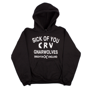
from all the designs I looked at Gnarwolves was one of my favouries for its simplicity and catoony feel for the CRU so I decided to  look into similar font styles
I liked how this slimy font was both comical and grim at the same time  as it was what I wanted my clothing to look like.

I eventualy set on the brand name mutiny skate wear as the term mutiny seemed quite fitting (to overthrow your masters yada yada yada...)
I drew the initial logo with the start of the M and Y being extended and turned the T into an inverted cross because satanism and cults are whats in these days I guess. once the logo was complete I decided to make a series of colour ways and paterns for MuTinY skate wear.


I just remembered I cant skateboard so now its MuTinY street wear. Okay? yea thats cool...
Nope.
Nope.
No.
Its not central.
you cant center even letters.
especialy if the T is in the middle.
 new name!
Turmoil street wear! because confusion and mass hysteria are also cool.
  
After finaly setteling with Turmoil I began to make designs for it (unfortunatly a mix of both blogger and my usb being as usefull as a jelly hammer this is the only picture that will upload) I created two designs one of a church up in flames and one of micky  mouse in Turmoil cloting. both of these designs would have to be printed comercialy as they were far to complex to print myself.

ThePrintingProcess:

we began printing  our garments with stencil printing where we would place our printouts under the semi transparent sticker, cutting it out, placing the sticker on the garment and dabbing ink over it with a sponge. 

cutting out

sticker in place!


layering up the ink

make it extra KVLTy by inverting some crosses

Now were the absolout **** out of it and watch as the girls want you and guys want to be you!

Monday, 9 March 2015

Emotion

As a group we shot some ideas for a general theme we could work from, after a long discussion we decided that we would have a theme of emotion.
I decided to work on fear.
For this piece I will create a series of costumes that will be fillmed shortly and looped they will pe presented on small television sets in a large blacked out room with these costumes in

Tuesday, 3 March 2015

1960s

The 1960s

Ritchard Hamelton's 'Just what is it' 1956
Just what is it that makes today's homes so different, so appealing? was created in 1956 for the catalogue of the exhibition This is tomorrow in London, England in which it was reproduced in black and white. In addition, the piece was used in posters for the exhibit. Hamilton and his friends John McHale and John Voelcker had collaborated to create the room that became the best-known part of the exhibition.
Hamilton subsequently created several works in which he reworked the subject and composition of the pop art collage, including a 1992 version featuring a female bodybuilder.


The 'Sergeant Pepper' Album artwork by Peter Blake

Sgt. Pepper '​s Grammey Award-winning album cover was designed by the pop artists Peter Blake and Jann Hawoth from an ink drawing by McCartney. It was art-Directed by Robert Fraser and photographed by Michael Cooper. The front of the LP included a colourful collage featuring the Beatles in costume as the Sgt. Pepper's Lonely Hearts Club Band, standing with a group of life-sized cardboard cut-outs of famous people. The heavy moustaches worn by the group reflected the growing influence of hippie style trends, while their clothing "spoofed the vogue in Britain for military fashions", writes the Beatles biographer Jonathan Gould. The centre of the cover depicts the Beatles standing behind a drum skin, on which the fairground artist Joe Ephgrave painted the words of the album's title. In front of the drum skin is an arrangement of flowers that spell out "Beatles". The group were dressed in satin day-glow-coloured military-style uniforms that were manufactured by the theatrical costumer M. Berman Ltd. in London.The album's lyrics were printed in full on the back cover, the first time this had been done on a rock LP.


'Chair, Hat Stand, Table' By Allen Jones

Hatstand, Table and Chair are three fibre glass sculptures of women transformed into items of furniture. They are each dressed with wigs, and are naked apart from their corsets, gloves and leather boots. Each is slightly larger than life-size. For Chair the woman lies curled on her back, a seat cushion on her thighs and her legs acting as a back rest. Table is a woman on all fours, with a sheet of glass supported on her back. For Hat Stand the woman is standing, 1.85 metres (73 in) tall, her hands upturned as hooks.
Each fibreglass figure was produced from drawings by Jones. He oversaw a professional sculptor, Dick Beech, who produced the figures in clay. The three female figures were then cast by a model company, Gems Wax Models Ltd, who specialised in producing shop mannequins. Each figure was produced in an edition of six.
Yves Klien:

Piero Manzoni:
His signature was his main thing
canned his shit and sold it at its weight in gold
Used women as his artwork
died at 29 to heart problems 


Fluxus:

Land Art:

Land art, earthworks (coined by Robert Smithson), or Earth art is an art movement in which landscape and the work of art are inextricably linked. It is also an art form that is created in nature, using natural materials such as soil, rock (bed rock, boulders, stones), organic media (logs, branches, leaves), and water with introduced materials such as concrete, metal, asphalt, or mineral pigments. Sculptures are not placed in the landscape, rather, the landscape is the means of their creation. Often earth moving equipment is involved. The works frequently exist in the open, located well away from civilization, left to change and erode under natural conditions. Many of the first works, created in the deserts of Nevada, New Mexico, Utah or Arizona were ephemeral in nature and now only exist as video recordings or photographic documents. They also pioneered a category of art called site-specific sculpture, designed for a particular outdoor location.

Minimalist:

Minimalism in the arts began in post–World War II Western Art, most strongly with American visual arts in the 1960s and early 1970s. Prominent artists associated with minimalism include Donald Judd, John McCracken, Agnes Martin, Dan Flavin, Robert Morris, Anne Truitt, and Frank Stella. It derives from the reductive aspects of Modernism and is often interpreted as a reaction against Abstract expressionism and a bridge to Postminimal art practices.
Minimalism in music features repetition and iteration such as those of the compositions of La Monte Young, Terry Riley, Steve Reich, Philip Glass, and John Adams. Minimalist compositions are sometimes known as systems music. The term "minimalist" often colloquially refers to anything that is spare or stripped to its essentials. It has also been used to describe the plays and novels of Samuel Beckett, the films of Robert Bresson, the stories of Raymond Carver, and the automobile designs of Colin Chapman. The word was first used in English in the early 20th century to describe "a 1913 composition by the Russian painter Kasimir Malevich of a black square on a white ground".

An Oak Tree:

An Oak Tree consists of an ordinary glass of water placed on a small glass shelf of the type normally found in a bathroom, which is attached to the wall above head height. Craig-Martin composed a series of questions and answers to accompany the objects. In these, the artist claims that the glass of water has been transformed into an oak tree. When An Oak Tree was first exhibited, in 1974 at Rowan Gallery, London, the text was presented printed on a leaflet. It was subsequently attached to the wall below and to the left of the shelf and glass. Craig-Martin’s text deliberately asserts the impossible. The questions probe the obvious impossibility of the artist’s assertion with such apparently valid complaints as: ‘haven’t you simply called this glass of water an oak tree?’ and ‘but the oak tree only exists in the mind’. The answers maintain conviction while conceding that ‘the actual oak tree is physically present but in the form of the glass of water ... Just as it is imperceptible, it is also inconceivable’. An Oak Tree is based on the concept of transubstantiation, the notion central to the Catholic faith in which it is believed that bread and wine are converted into the body and blood of Christ while retaining their appearances of bread and wine. The ability to believe that an object is something other than its physical appearance indicates requires a transformative vision. This type of seeing (and knowing) is at the heart of conceptual thinking processes, by which intellectual and emotional values are conferred on images and objects. An Oak Tree uses religious faith as a metaphor for this belief system which, for Craig-Martin, is central to art. He has explained:
I considered that in An Oak Tree I had deconstructed the work of art in such a way as to reveal its single basic and essential element, belief that is the confident faith of the artist in his capacity to speak and the willing faith of the viewer in accepting what he has to say. In other words belief underlies our whole experience of art: it accounts for why some people are artists and others are not, why some people dismiss works of art others highly praise, and why something we know to be great does not always move us.